ShopDreamUp AI ArtDreamUp
Deviation Actions


Description
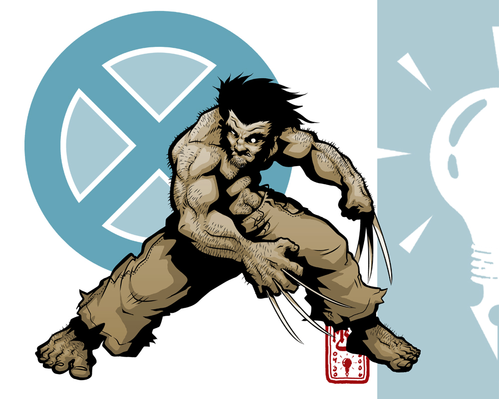
I've been trying to work my way out of a bit of a drag, lately, so I'm trying a few new things. For instance, I'm drawing a Marvel superhero... something I almost never do. I'm also trying out a little graphic design, working with shapes and colors and such. It's not something I do often enough, so I figure it's good to bump the noggin a little and try to expand my sights.
Originally this was just a little inking practice... the illustration was drawn on sketch paper and inked digitally in Manga Studio EX. Total inking time, 'bout an hour, maybe hourannahalf.
From there I brought it to Photoshop and began diddling with it some more... my color theory skills are pretty weak, but I did go into this with some ideas about "warm" and "cool" colors, which is something at least. I also did some playing about with basic shapes and composition, not so much trying anything academic... just moving elements about and seeing what I like the look of. Total time in Photoshop... 'bout another 3 hours, maybe? I did mess around a lot.
At any rate, it's also possibly worth mentioning that I haven't been a Wolverine fan in over 10 years, not since the Silvestri days, so I might not have the character down so much as he is today... if you have issue with how he looks, remember that I'm an old-school Patch-in-Madripoor fan, not a current reader. In my mind he's always short, hairy, and ill-tempered.
So anyhow, since this is half-expirimental, I'm open to any suggestions, ideas, comments or crits. If you got something constructive to say, say it!
-EDIT-
Couple of guys at PJ pointed out a damn fool error in anatomy that I can't really fix, but I can at least patch up (and have). Oh well, live n' learn.
-EDIT II-
Made a few more tweaks.
Image size
1000x800px 316.56 KB
© 2006 - 2024 Inkthinker
Comments65
Join the community to add your comment. Already a deviant? Log In
Very, Very Awesomely rendered! ")